Pantone has already a verdict: this 2017, the green colour called “Greenery” will be the trend. From Lucirmás, we are very happy about it for some reasons: green is one of the most present colours in our creations and, the reason because this colour has been chosen it is closely related to Lucirmás philosophy. In this post, apart from telling you about this colour, I want to help you to combine it with others to stand out its virtues and awaken different emotions:
Greenery, the new Pantone color for 2017
Why Greenery? Greenery is a type of green with a yellow touch that reminds us of the fresh grass, the spring coming and the connection with nature. It is also a colour which represents the hope and the words that start with re, as renovating, regenerating or refreshing. And, what we do in Lucirmás but recycling giving a second life to glass bottles?
Pantone trends experts also said that this colour choice is also related to Japan culture (if you notice, this green is also the matcha tea green and the wasabi green). In this stressing world in which we live, from time to time we need a little bit of green to stay calm. In this sense, in Japan exist the concept “forest bath” that says that, if you are under much stress, the best thing you can do is take a walk in the countryside. In all houses having a green item, specially if is a living being, is highly recommended, because it gives us the calmness and joy that we need.
How to combine the different green tones
Colour affects the senses, the appearance, the mood, event the behaviour, so it is basic to include colours in our lives that proportionate us joy, calmness, energy… Green is a colour I’ve always loved. Apart from the colour itself, i find fascinating its combination with other colours.
Now I’m going to show you some of the colour combinations with green that I consider the most attractive and interesting:
The red colour, for example, it is more than a right choice. It is a complementary colour and, as it indicates, it is perfect to complement green’s vitality. In our case, we immediately notice it when we pour wine in one of our glasses!
The green&violet combination is one of my favourites. It transmits strength and energy! The effect of both colours together is very interesting and even a little eccentric, which would give a unique touch to the ensemble.

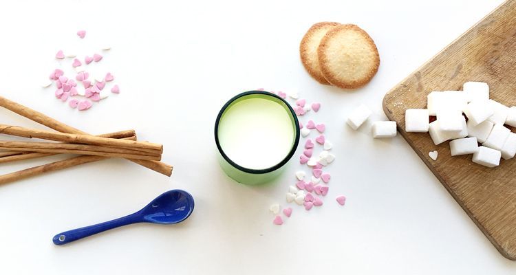
Pink. Together with green, this colour creates a complementary combination with diametrically opposite tonalities in the chromatic circle. Moreover, being a light colour, it allows to highlight all that surrounds it, transmitting calmness, levitation and fluency.
Regarding white colour, the combination evokes innocence and pureness particularly when combined with green bottles. Its brightness, too, emphasizes the energy that already green colour transmits and, if the material employed is glass, even more!
Lastly, I want to point out the combination of green with orange. In chromotherapy, orange is considered as a stimulant to recovery from illness, because it brings joy and optimism. Combined with green, together they give this incredible positivity and energy feeling. IF, four example, you drink a fresh orange juice in a green glass, this energy and movement feeling that orange colour carries multiplies. There are no better way of starting the day as this one!

The green colour, when appears in form of a glass, has an added value. If the green color itself transmits energy and positivity, the ability of allowing the light to pass through, as in the case of the glass, adds to this color this extra luminous touch and also transparency, which makes it even more special.
That’s why last year I created Six in green, a green pack of glasses that evokes the beauty and diversity of green colours that characterize the glass bottles. There are so many green tones!

The glasses, moreover, being so versatile, allow us to enjoy multiple combinations depending on the beverages we pour them in: juices, fresh milk, wine…
If you do not have anything green in your house yet, I encourage you to put this color i your life and immediately you would be aware of this new refreshing and calm touch. For me, if green was already a very present colour in my life, more is going to be in 2017!
See you soon!
Lucía